TimeBee’s Team Dashboard provides maximum visibility into the most important insights and summaries of the workforce and groups at daily, weekly, quarterly, or monthly levels.
The work hour distribution widget is right at the top of your screen when you open the Team Dashboard from the web app. It shows the sum of the total worked hours of every user accumulatively and divides the time into 4 categories.
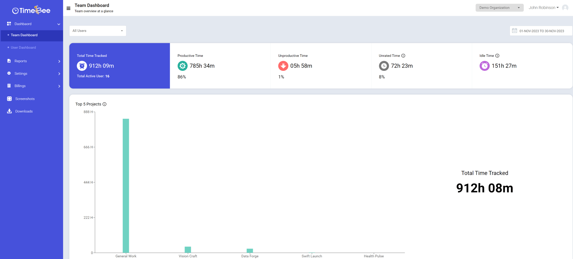
It helps to find out the productivity level of the whole company at a glance.
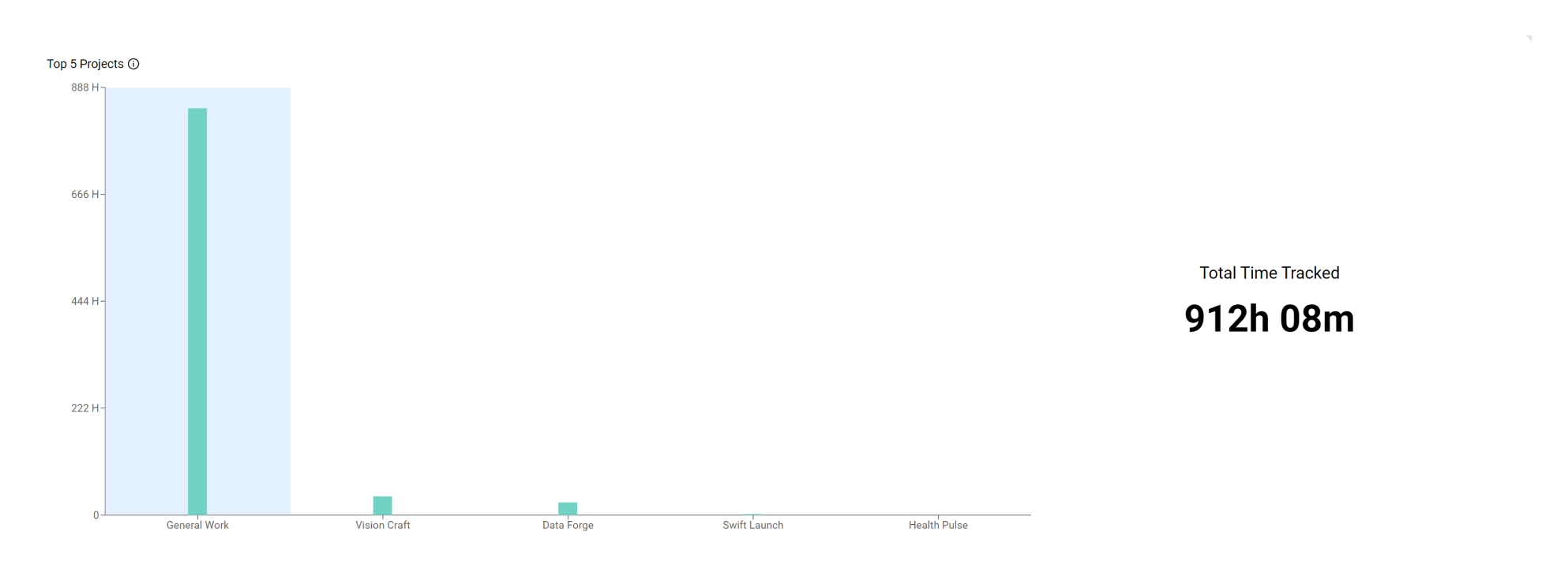
The top Project widget is right below the Work Hour Distribution widget. It gives a summary of all the active projects and how many hours have been spent on each. It also shows the total tracked time on the side.

You can easily keep tabs on the projects and evaluate the progress.
This widget is divided into two parts.
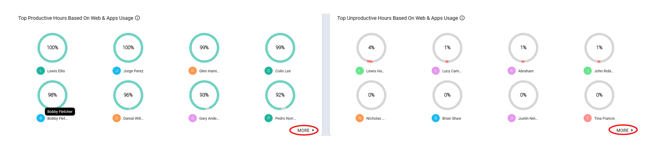
This widget is also divided into two parts.
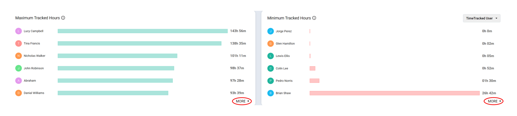
It is the last widget on the Team Dashboard and is also divided into 2 parts.
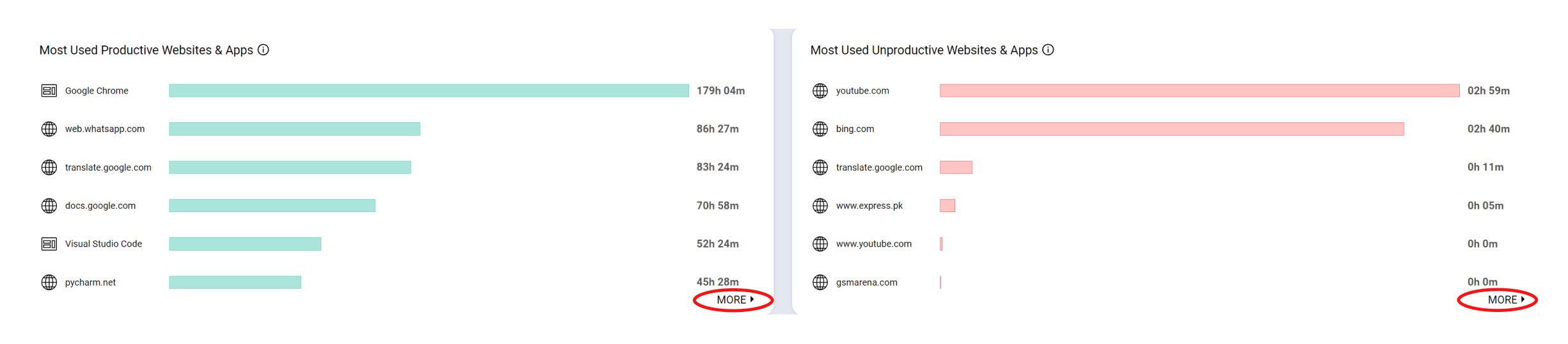
Click here to learn how to use the Web & Apps Usage report.
To view specific summaries for a single user, multiple users, or groups, use the “User” filter. For date-specific summary reports, set the date from the “Date” filter.
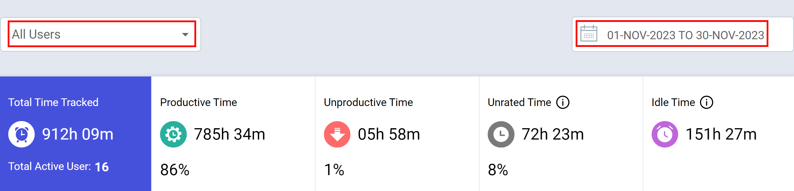
Only the owners or the admins can access or view the Team Dashboard.
Try it free for 14 days and see how it can be your savior!
